
A new face for Quanteec
Chronicle of a necessary evolution
Today, we are not presenting a brand; we are opening the notebook. This article exists to calmly tell why we changed, how we did it, and what we mean when we dress Quanteec in these blues.
Why we changed
It wasn’t a flash of inspiration or an aesthetic whim. It was the natural need of a company that grows, earns its place, and tunes its voice. What we are trying to reach is the refinement of what Quanteec represents today: efficiency above all. Because good technical decisions have consequences that matter: they benefit the planet, improve the user experience, and give breathing room to companies, whatever their role in the industry. One well-taken decision helps; many well-taken decisions build a sturdier industry, less exposed to the swings of the moment. In that ecosystem, the technology Quanteec proposes is, objectively, a sound choice.
What Quanteec represents now
We wanted an identity that says the same thing our product says: clarity, control, and performance.
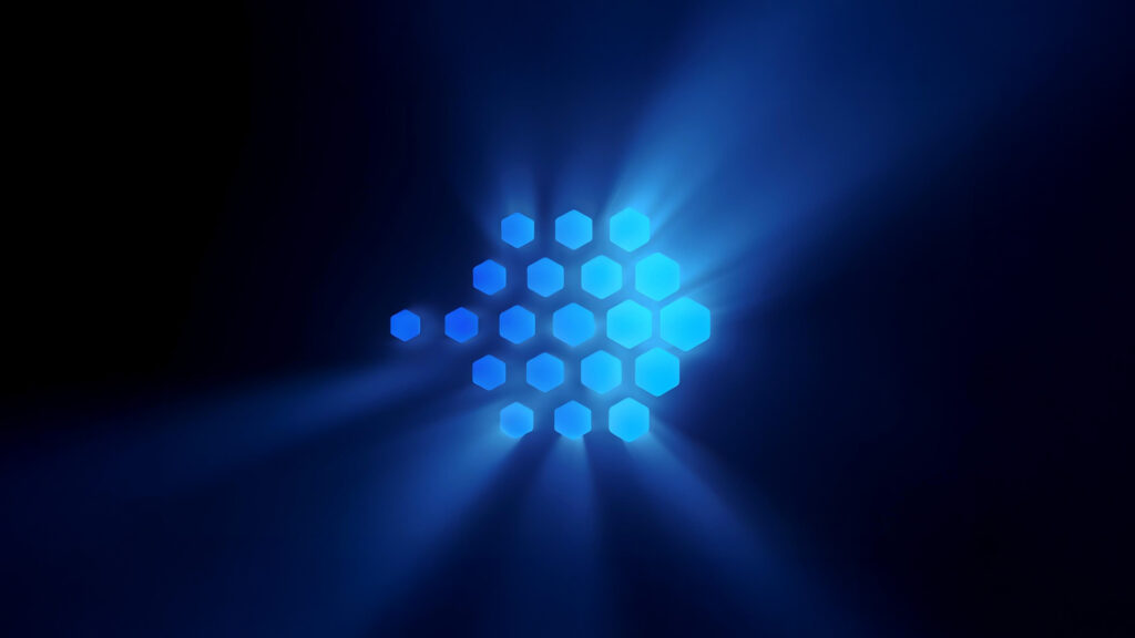
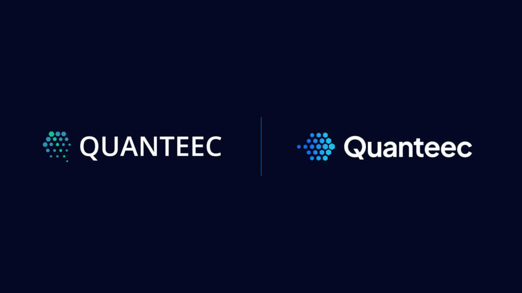
The blues
We moved to a sharper, more precise family. It is not a “decorative” color; it is a system. The gradient and its intensities organize hierarchies, states, and emphasis across interfaces, dashboards, and documentation. It reads well, operates well, and performs well.
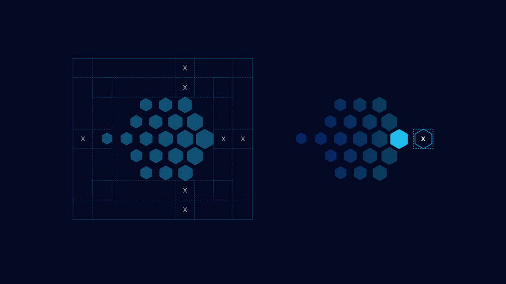
The form
How could we abandon hexagons? They are not only a nod to France; they are a supremely noble geometric shape, the most efficient way to fill a two-dimensional space, as internally connected with us as we try to connect viewers.
The voice
Direct. Without promising miracles. Efficiency explained with numbers and applied where it hurts: spikes, costs, resilience, and control.
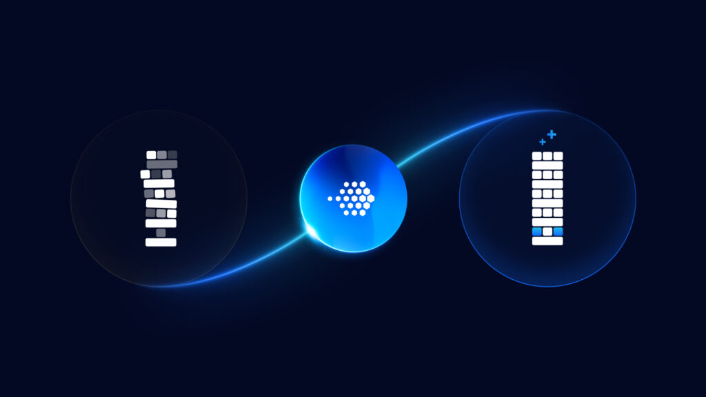
Streaming today: taking a position
Streaming is going through a crisis of balance. It is not solved by adding more iron to the network or filling the map with dots. Our path seeks to balance the delivery chain by activating underused resources and prioritizing efficiency as the operating principle.
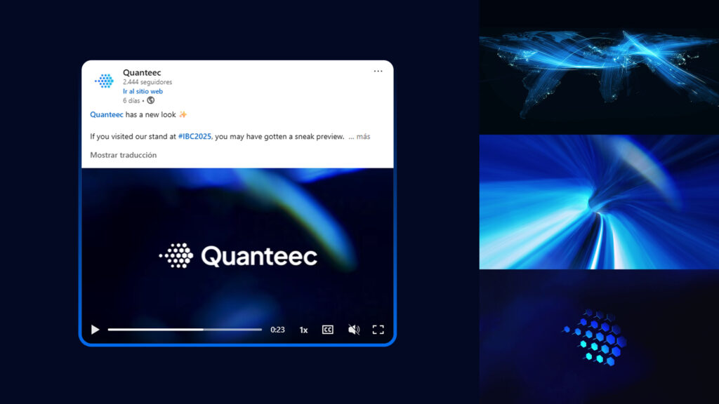
And one day, we launched it
Those who stopped by our stand at IBC had already seen the avant-première. You could tell from the messages, the curiosity, the waiting. The day of the LinkedIn post was simply the confirmation. Along with that publication came the updated site, banners, profile photos, and email signatures. And, above all, a video made with care, reflecting what we feel streaming is and could be if we achieve our goal.
We believe the future of streaming is not about bigger infrastructure, but about smarter connections.
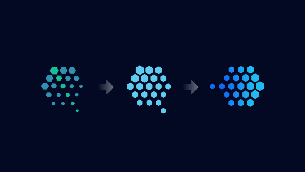
And the green?
We loved it. Letting it go doesn’t mean abandoning “green.” It means focusing. At Quanteec, sustainability comes as a consequence of efficiency. If we reduce waste and improve technical decisions, environmental and economic indicators follow. The color change is part of that focus.
Team
We tackled it in-house. I, Pablo Vázquez, together with Darío Calderón and Facundo Romero. And everyone pitched in: design, copy, QA… even our CEO jumped into the site’s code. It was intense and worth it.
To close
This identity is not a costume; it is a working tool. It was born to explain what we do and to accompany what is coming. Thank you to those who shared feedback ahead of time —many colleagues at partner companies— and thank you to the team for their patience through every iteration. If this brand feels clear, it is because we listened and put things in order. We keep going.